

Dave’s Redistricting App, a free web app that allows anyone to draw congressional or legislative maps, recently added support for 2018 American Community Service (ACS) estimates. Unlike the existing support for 2010 voting districts or 2016 block groups, however, this support is a bit hidden. This guide should allow you to find and use these numbers properly.
Setting the map up


The first thing you’ll want to do is login to your Dave’s Redistricting App account. If you don’t have an account, you have to register. It’s definitely worth it, however, as it gives you access to your maps over the cloud. Once you’ve signed it, click “New Map”. A window titled “Map Set Up” should pop up. For this example, I’ve chosen North Carolina, but it seems that most, if not all states support 2018 numbers. 2018 ACS estimates are only included in the 2010 Voting Districts data source, so you’ll want to chose that one.
Finally, if you’re planning on approximating potential maps for 2022, you’ll want to use the proper number of districts. There are plenty of sources, like this one from RealClearPolitics, that will tell you what states are likely to gain or lose seats because of population shifts from the Census. In this case, North Carolina gains a seat, taking it from 13 to 14 seats. Once you have all of the information selected, press “Apply”.
Drawing a map
Once you’ve pressed “Apply” your map will load. It should look something like this:

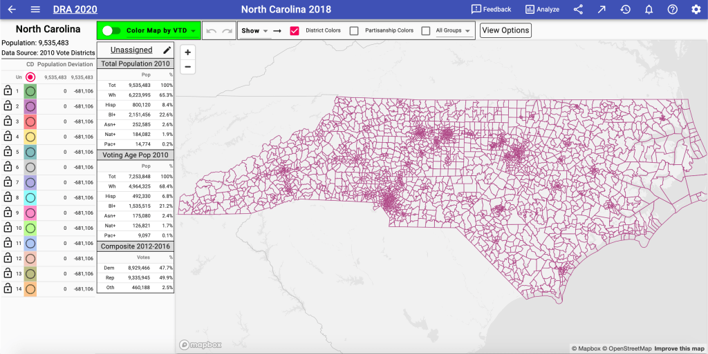
You’ll notice that we are using 2010 Vote Districts, so the default population totals are from 2010. Using 2018 Census estimates in Dave’s Redistricting App is a little bit more complicated than using the base totals, but it’s not too hard.


To access the 2018 ACS estimates, you’ll want to select the pencil icon next to “Unassigned”. This will open up a window titled “Customize District Panel”. What this window enables you do is to modify the numbers you see below “Unassigned”.
You’ll want to deselect “Total Population 2010” and “Voting Age Pop 2010” and select “Total Population 2018”. This will mean the only population information in the District Panel will be from 2018. Finally, select whatever political results you want as well. In this example, I selected “President 2016”, “Governor 2016”, and “Senator 2016”. Once you’ve selected all the information want, scroll down in the window and select “Close”. Your window should now look like this:

Drawing your map
You’ll notice that the default population totals haven’t been changed to the left of the District Panel. This cannot be changed from what I can tell. What this means is that you can’t rely on that information. Instead, you need to rely on the data in “Total Population 2018”, which lists North Carolina as having a population of 10,155,598 people.
Since we’re drawing 14 districts, divide “Total Population 2018” by 14 and you get 725,400 people. That is the ideal population per congressional district. You might want to keep track of the numbers from each congressional district in a spreadsheet for larger states.
We’re now ready to begin drawing our map in Dave’s Redistricting App. I’ve started with a congressional district in the west. Here’s what it looks like:

In 2010, this district would have been unacceptable as it was overpopulated compared to the ideal population of 681,106. However, if we check the updated totals under “Total Population 2018”, this district has a population of 725,733 people – that’s only 333 off the ideal 2018 population of 725,400. Generally speaking, you’ll want to keep deviations within 1,000 people or so.
One other thing to note is that Voting Rights Act-mandated majority-minority seats rely on voting-age population (VAP), not total population. VAP tends to have fewer minorities per seat than total population would expect, so a good rule of thumb is to include about 3-5% more of the minority group than the total population numbers would suggest.
Finishing your map
Now that we have one seat, let’s continue drawing our map:

I’ve drawn an additional congressional district here. Notice again that the 2010 population would discredit this seat, but with 2018 ACS estimates it’s actually slightly under the ideal population. Be sure to use the information under “Total Population 2018”, not the ones to its left.

Once you’ve finished drawing all the districts, as this map is above, take one final look at the population for each district. In this map, the districts with the most variation from the ideal are 9 (+506) and 7 (1,584). Seven seats lean Republican, six lean Democratic, and one is a tossup.
Make any changes you feel necessary at this point, but be sure to keep the population variance in a reasonable range. Once you’re finished with your map, click the back arrow at the upper left of the screen to exit out. Your map saves automatically as you draw it, however, so you could also just close the window to leave the site entirely.
Conclusion
While it might be a little bit more complex than ordinary drawings in Dave’s Redistricting App, it’s still fairly easy to use the 2018 ACS estimates. With a little bit of extra math and a spreadsheet, even maps with dozens of districts can be done this way.
Using these updated population totals will allow you to get a closer look at population and demographic shifts ahead of the upcoming Census. If you have any questions, be sure to ask them in the comments below or on my Twitter account (@decunningham2).